
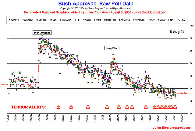
via the invisible library, i found this chart, comments, and timeline about the correlation between bad news for the administration and past terror alerts.
the chart is a little messy--individual polls fluctuate, even as there is a general downward or upward trend in bush's approval rating. by my reading, at least, it seems like there is a pretty clear pattern of alerts coming a few days after bad news and negative poll results. but the most striking pattern is how the frequency of alerts has increased dramatically since the iraq war began. so much for making us safer.